expanding the guild brand
Services
Branding
Signage
Stationary
Web Design
Art Direction
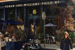
Guild Gallery was the natural extension of Roman and Williams Guild—an eclectic world of people, objects and furnishings, a modern-day guild of the senses. Guild was designed as a place to showcase the custom-designed furniture alongside the work of artisans admired for their skill and dedication to technique. Guild Gallery was the next stage of evolution in this dialogue. While the Guild celebrates a beauty that derives from function, the Gallery focuses purely on form. Whereas the Guild is all about an eclectic mix, the Gallery spotlights the object, artist, and process.
Given the strong ties to the foundation of the Guild brand, building on the existing Guild logotype felt conceptually aligned. The distinction would instead be made in the palette, typography and executions with an emphasis on warmth, purity and focus.


The refined typography in a structured grid evokes an elevated and serious tone.

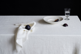
The high craft of the artworks is echoed in the brand collateral through a considered use of premium materials, printing methods, and digital executions. The integration of a strong grid-driven environment in each design provides a clean canvas for the Artists and their works to be appreciated.


Related Projects
Roman and Williams Guild
Art Direction, Signage, Sales Tools, Print Design
Roman and Williams Guild
Art Direction, web Design

expanding the guild brand
Services
Branding
Signage
Stationary
Web Design
Art Direction
Guild Gallery was the natural extension of Roman and Williams Guild—an eclectic world of people, objects and furnishings, a modern-day guild of the senses. Guild was designed as a place to showcase the custom-designed furniture alongside the work of artisans admired for their skill and dedication to technique. Guild Gallery was the next stage of evolution in this dialogue. While the Guild celebrates a beauty that derives from function, the Gallery focuses purely on form. Whereas the Guild is all about an eclectic mix, the Gallery spotlights the object, artist, and process.
Given the strong ties to the foundation of the Guild brand, building on the existing Guild logotype felt conceptually aligned. The distinction would instead be made in the palette, typography and executions with an emphasis on warmth, purity and focus.

The refined typography in a structured grid evokes an elevated and serious tone.


The high craft of the artworks is echoed in the brand collateral through a considered use of premium materials, printing methods, and digital executions. The integration of a strong grid-driven environment in each design provides a clean canvas for the Artists and their works to be appreciated.


Related Projects
Roman and Williams Guild
Art Direction, Signage, Sales Tools, Print Design
Roman and Williams Guild
Art Direction, web Design
Design and Art Direction for persons and businesses in the realms of art, architecture, hospitality, commerce, interior design, real estate and cultural muses.
©MWR DESIGN CO, 2025

